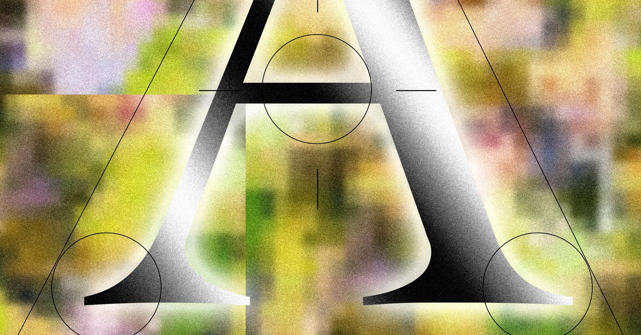
Does a typeface choice determine the humanity of an algorithm? That’s the peculiar question now dominating the digital design landscape, as the public’s growing unease with artificial intelligence prompts a desperate search for its telltale signs. We’ve already seen backlash against AI-generated prose that leans on the predictable “rule of threes” or overly formal sentence structures. Now, it seems, the digital ink itself—specifically, the serif font—is being weaponized.
This isn’t just about aesthetics; it’s a calculated psychological gambit. Companies developing AI are increasingly adopting serifs, those classic fonts with the little feet at the end of their strokes, like Times New Roman or Garamond. The rationale, articulated by designers and critics alike, is to imbue inherently cold, opinionless AI products with personality, warmth, and crucially, trust. Keya Vadgama, a writer and designer, has dubbed this phenomenon the “serif renaissance,” arguing that it’s a direct response to AI’s perceived lack of soul. “It signals ‘We’re AI! But real humans use (and made) our product! We swear!’” she notes, summarizing the brand messaging.
AI Has Come for Serif Fonts
Consider Anthropic’s Claude, which defaults to serifs. Runway, Perplexity, Manus—all are employing similar typographic choices in their user interfaces and branding. Perplexity’s chief communications officer, Jesse Dwyer, plainly states, “Why wouldn’t we have human design? Perplexity is for people.” It’s a straightforward appeal: if the product is for humans, it should look human.
This isn’t entirely new territory. The serif font has long been associated with authority, scholarship, and gravitas. The US State Department recently reverted to Times New Roman, with Secretary of State Marco Rubio dismissing Calibri as “informal.” Books, newspapers, and the venerable Encyclopedia Britannica historically relied on serifs, forging a deep-seated public association with knowledge and trustworthiness.
Serifs have an origin in calligraphy. It connotes a very human, fluid way of making letterforms.
But herein lies the rub: is this a genuine embrace of humanistic design, or just a sophisticated form of digital camouflage? Critics deride it as “tasteslop” or “generic” and “very ugly.” The fear is that by co-opting symbols of human creativity and authority, AI companies are merely plastering over the cracks, creating an illusion of warmth without fundamentally altering the cold, algorithmic core. This trend could lead to a dilution of what makes serif fonts impactful, turning them into a universally recognized, and thus meaningless, AI stamp of approval.
Is This Serif Trend a Genuine Humanization Effort?
The shift away from the sharp, sterile look of sans-serif fonts—often perceived as purely digital and impersonal—towards the more traditional serifs is a deliberate rebranding. For decades, the sleek, modern aesthetic of sans-serifs dominated tech, a look that now, paradoxically, feels increasingly dated and, well, robotic. The “sterile look of tech that has dominated for the past 20 years has increasingly negative connotations,” explains Ali S. Qadeer, chair of graphic design at the Ontario College of Art and Design. He sees the serif trend as a direct response to this social critique, an effort to “soften people up.”
Yet, not everyone views this with alarm. Yitong Zhang, a designer and founder, described the serif transition as “cursed” but ultimately pragmatic. “Somebody at these labs is trying to get these models to be good at design,” he posits. This pragmatic view suggests that the font choice is less about deception and more about experimentation in finding design approaches that resonate with users. It’s a way to test the waters of user perception without overhauling the underlying technology. In this light, the serif renaissance is less a sinister plot and more a practical, albeit perhaps ethically grey, design iteration.
But let’s be clear: the market dynamics here are telling. When a technology’s primary challenge becomes convincing users it’s not inherently alienating, the aesthetic choices become paramount. The market doesn’t just reward functionality; it rewards comfort and familiarity. By adopting serifs, AI companies are buying into a long-established visual language of trustworthiness. It’s a market signal, a product of the intense pressure to integrate AI into our lives without triggering existential dread. Whether this will foster genuine connection or simply breed a new kind of digital distrust remains to be seen—though the speed of adoption suggests the former is, at least, the intended outcome.
What Does This Mean for the Future of AI Branding?
The implications extend beyond just fonts. We’re likely to see a broader push toward design elements that mimic human craftsmanship and tradition. Expect more textured backgrounds, subtle imperfections, and perhaps even a resurgence of analogue-inspired interfaces. The core challenge for AI developers moving forward will be balancing innovation with integration. Can they create AI that is not only powerful but also perceived as a benign, even helpful, presence? The serif trend is a bold, if debated, first step in that direction. It’s a visual heuristic, a shortcut to a feeling of established legitimacy. The question is whether users will continue to buy it, or if they’ll eventually see the serif for what it is: just another algorithmically chosen element designed to evoke a human response.
🧬 Related Insights
- Read more: 3:17 AM Pager Hell: Why On-Call Still Breaks Engineers
- Read more: Ghostwriters Spill: Crafting Tech’s Cringe Empire Amid AI Uprising
Frequently Asked Questions
What is a serif font? A serif font is a typeface that has small decorative strokes, or ‘serifs,’ attached to the end of the main strokes of letters. Examples include Times New Roman, Georgia, and Garamond.
Why are AI companies using serif fonts? AI companies are using serif fonts to project a sense of warmth, personality, and trustworthiness, aiming to counteract the perception of AI as cold and impersonal.
Is this a sign that AI is becoming more human? Not necessarily. The use of serif fonts is primarily a branding and design strategy to make AI products feel more approachable and familiar to human users, rather than a reflection of inherent human qualities in the AI itself.