Agents need charts. Now.
Here’s the thing: your fancy LLM, the one that crunches numbers with terrifying accuracy, is failing miserably. Not because it can’t compute. Oh no, it’s a math whiz. It’s failing because it can’t communicate. It’s churning out massive markdown tables, dense walls of text that would make a seasoned accountant weep. This isn’t insight; it’s an information dump.
The Markdown Trap is real. Executives don’t want to scan 50 rows of data. They want the gist. They want anomalies. They want trends. They’re visual creatures, and shoving raw numbers at them is a cognitive load failure of epic proportions. You’ve automated the calculation, but you’ve punted the interpretation right back to the human. Brilliant.
Think about it. Would a junior analyst send a 100-row CSV to their boss? Of course not. They’d whip up a pie chart. A heat map. Something digestible. Data isn’t an insight until it’s synthesized. If we want these agents to be true consultants, they need to be artists. They need to learn to draw.
Is This Just Pretty Pictures?
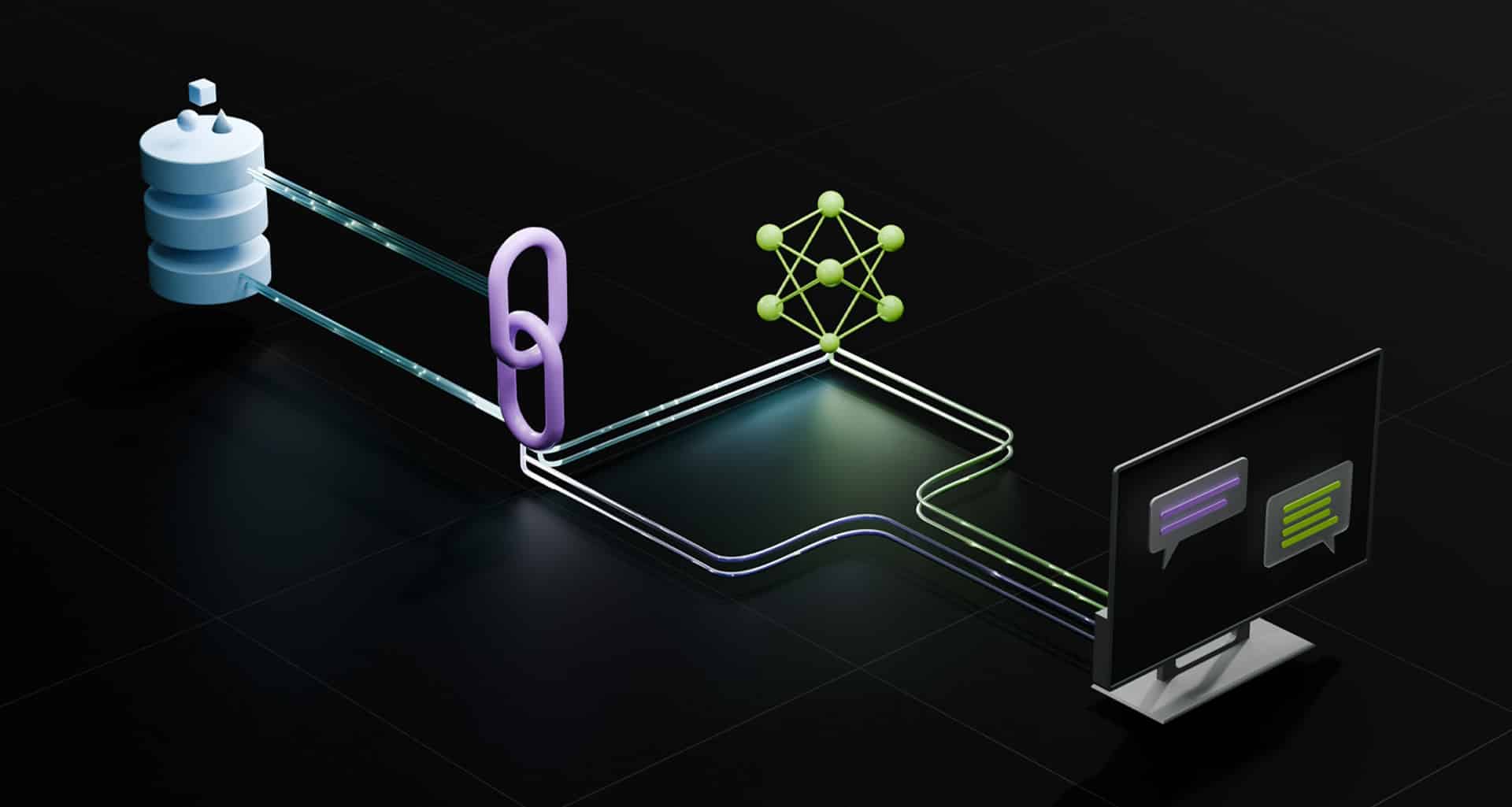
This isn’t about aesthetics. It’s about effectiveness. Human consultants don’t send raw data files. They send slide decks. The visualization is the deliverable. We need to architect our agents to do the same. This means introducing a visualization engine, a tool like generate_chart, into the agent’s workflow.
The process looks something like this: The agent pulls the data, crunches the numbers (using its Python sandbox, naturally), and instead of spitting out text, it calls generate_chart. It specifies the data, the chart type, and a title. A visualization library then takes over, rendering a proper image—a scatter plot, a line graph, whatever makes sense—and that’s what lands in the chat UI.
“We must architect our agents to produce this same deliverable. We achieve this by introducing a visualization engine to the Agentic Sandbox, exposed via a new performatory tool: generate_chart.”
This shifts the cognitive load. The LLM decides what chart is best. A specialized library handles the execution, ensuring it’s visually perfect. Suddenly, your chaotic terminal window transforms into a dynamic enterprise dashboard. It’s polished. It’s effective. It’s what humans actually need.
The Visual Agent: A Historical Blunder?
This whole markdown table debacle reminds me of early enterprise software. Remember when spreadsheets were just rows and columns? We’ve had decades to figure out that raw data is useless without context and visualization. Yet, here we are, building advanced AI that seems to have forgotten that lesson.
Companies touting their LLM agents without a strong charting capability are essentially selling a calculator that speaks in logarithms. Impressive for the engineers, maybe. Utterly useless for the people signing the paychecks. It’s a classic case of building technology for technology’s sake, rather than for actual human usability.
This isn’t just an oversight; it’s a strategic misstep. The ‘last mile’ of data analytics, as the original piece correctly identifies, is communication. If your AI can’t present findings in a way that resonates with a non-technical audience, it’s not delivering value; it’s creating more work. The integration of generate_chart isn’t just a nice-to-have; it’s a fundamental requirement for any LLM intended for enterprise use. Anything less is just noise.
🧬 Related Insights
- Read more: ChatGPT Slashes Ops Coordination Time by 28% – McKinsey Data Backs It
- Read more: NixOS Switched Me from Distro Hell—But Don’t Expect Miracles
Frequently Asked Questions
What is the “Markdown Trap”?
The “Markdown Trap” refers to the tendency of LLM agents to output complex data solely as unreadable markdown tables, hindering human comprehension and decision-making.
Why are charts better than markdown tables for executives?
Humans are visual. Charts quickly convey trends, anomalies, and comparisons, significantly reducing the cognitive load required to interpret raw numerical data presented in tables.
Will this new charting capability replace data analysts?
No, it’s designed to augment them. By handling the tedious task of data synthesis and visualization, these tools allow analysts to focus on higher-level interpretation and strategy.